FromGeneric Organic To A Brand
That Signals Purity And Trust Instantly
Aroma Organic had the right product, but lacked a strong visual identity to communicate its quality.
We rebuilt the brand to improve shelf visibility, credibility, and consumer trust.

The Challenge
The product was good. The perception wasn’t.
- Packaging didn’t clearly communicate “organic” or “premium”
- Weak shelf differentiation in a crowded spice category
- Brand lacked emotional connection with consumers
- No consistent storytelling across packaging and digital
The Approach
We built a brand that feels as pure as the product itself.
- Used color, layout, and typography to improve clarity and trust
- Built a consistent brand presence across shelf and digital
- Designed a clean, minimal packaging system to signal organic quality
- Created content (recipes + visuals) to connect product with real usage
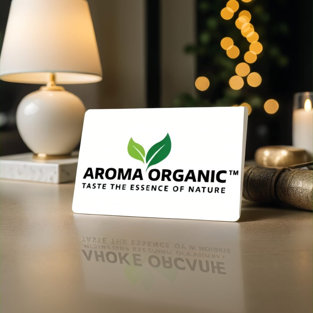
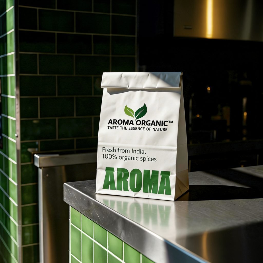
The Brand Look
A Visual Identity That Instantly Signals “Organic”.
Clean layouts, natural tones, and structured design created a sense of purity and authenticity.
Showing The Product Behind The Brand
Factory and process visuals reinforced quality, sourcing, and authenticity.
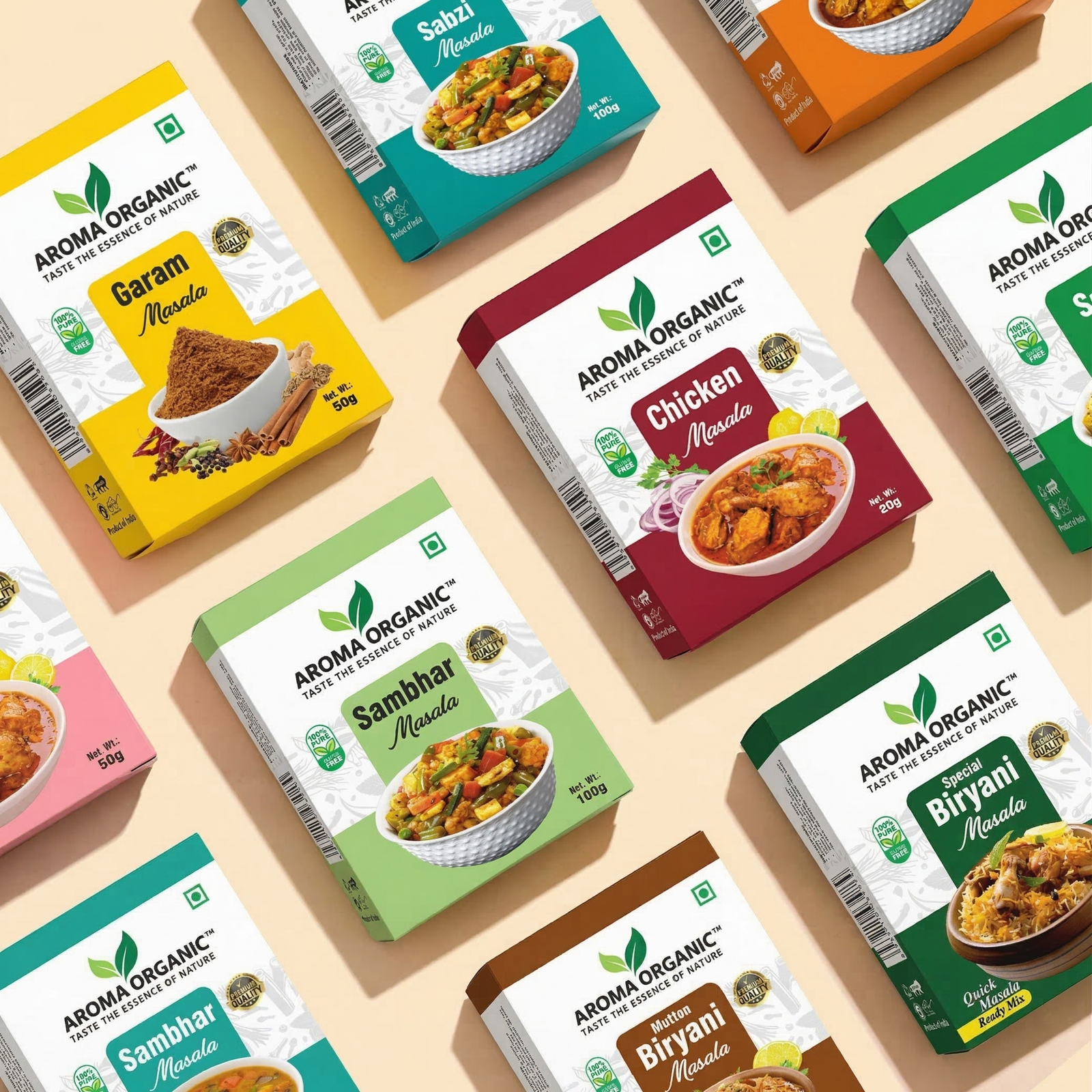
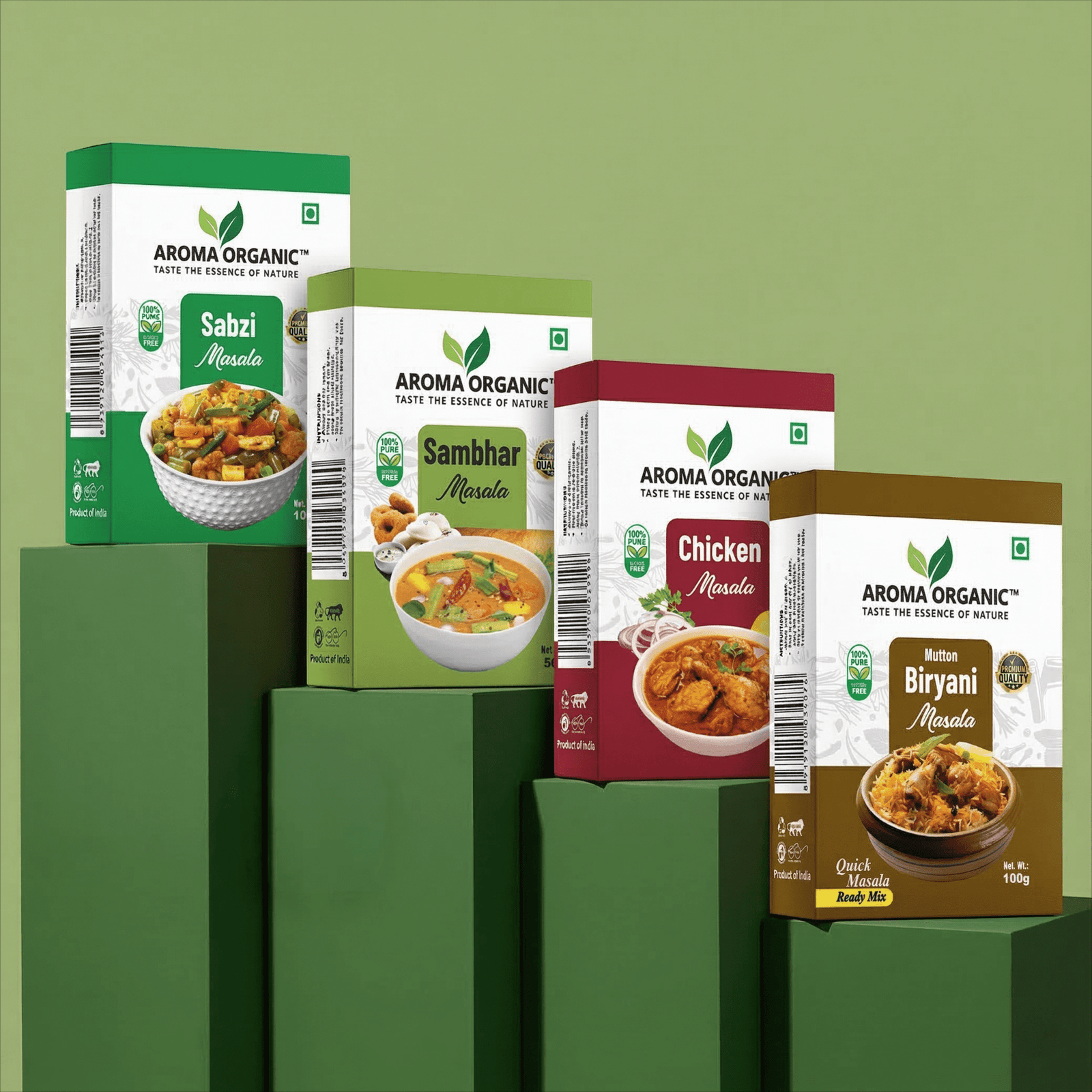
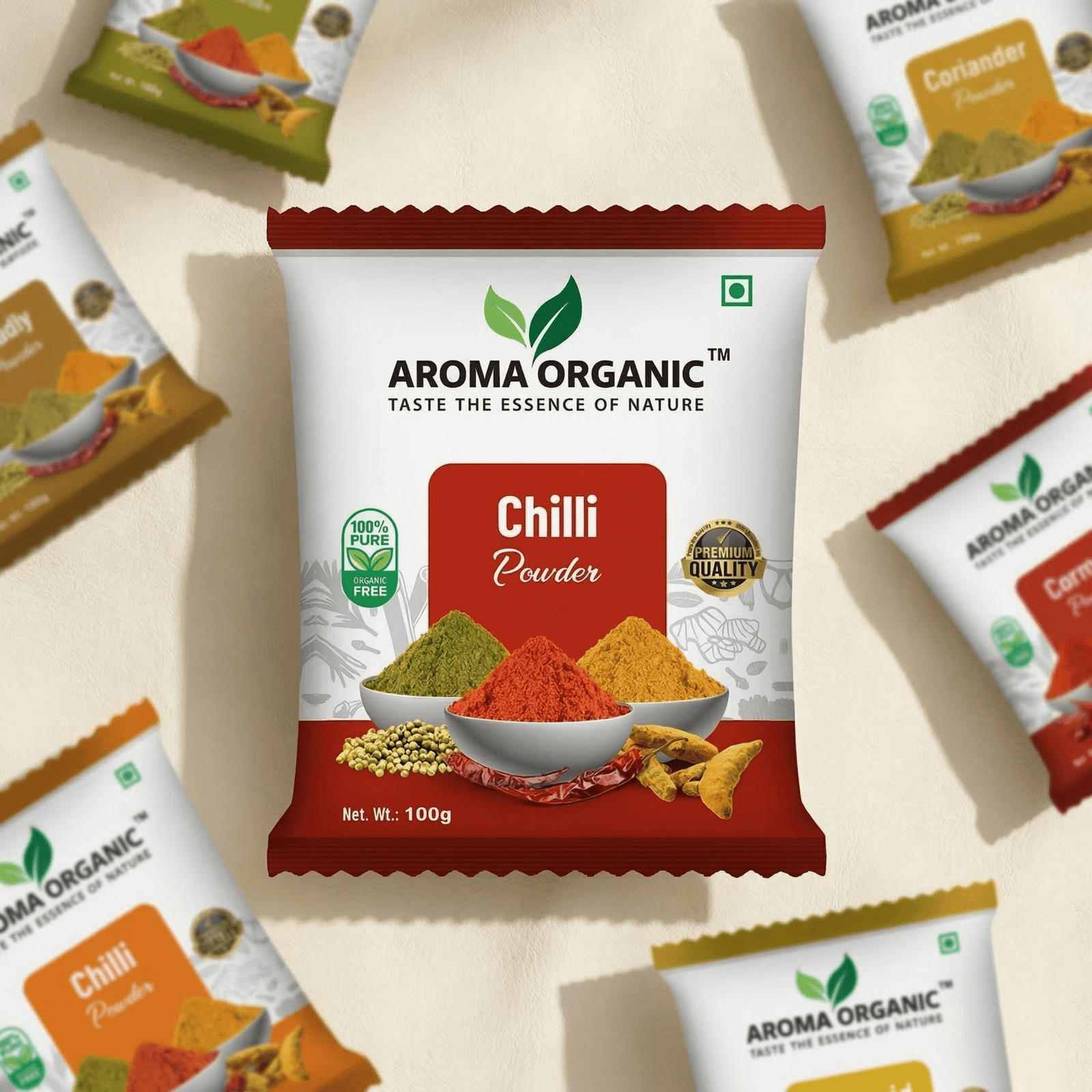
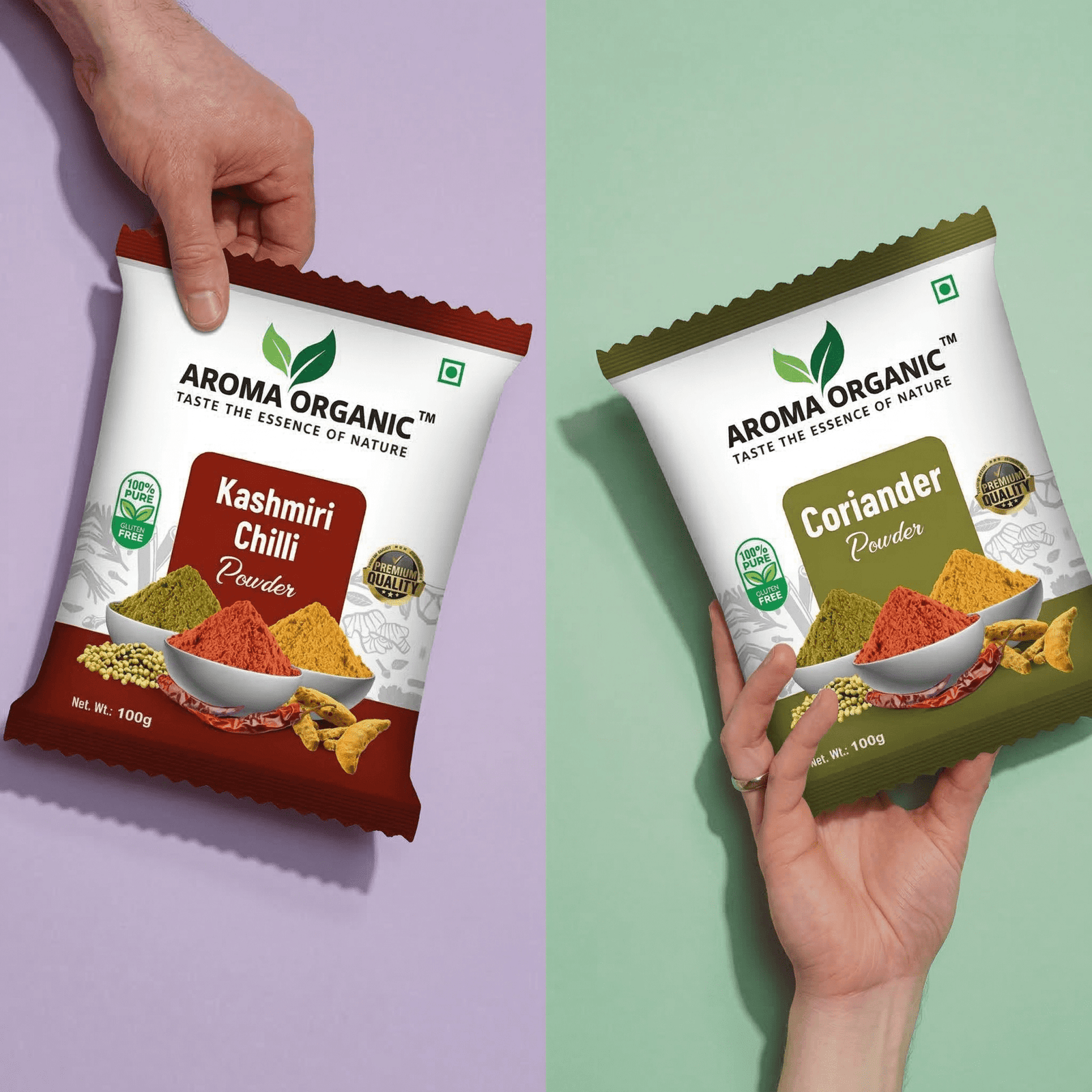
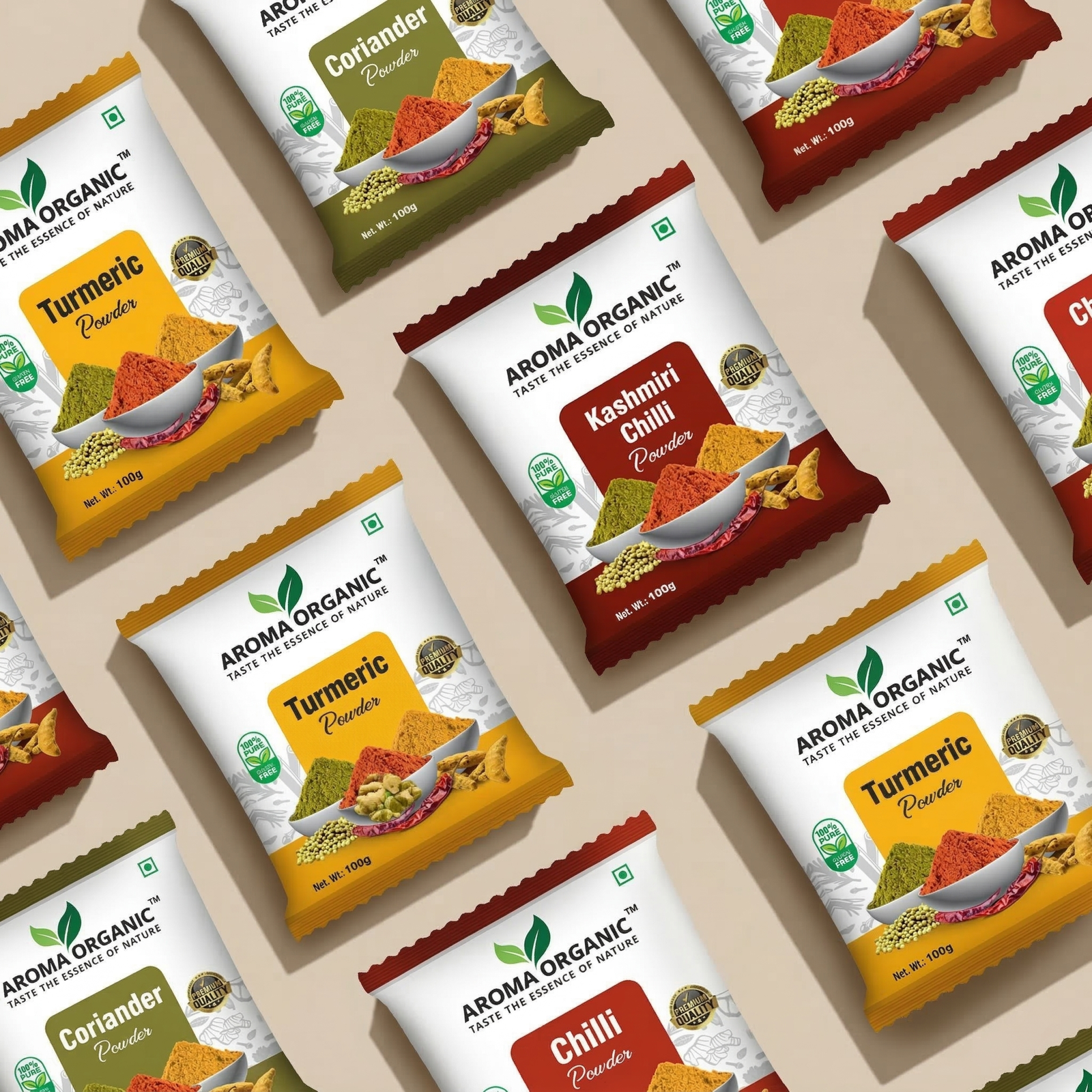
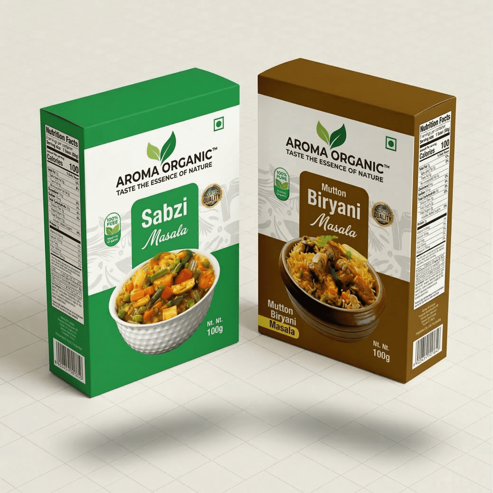
Our Packaging Designs
Packaging That Communicates Purity At First Glance.
Minimal design and clear hierarchy help buyers quickly understand product quality and intent.
Connecting Product To Real Usage
Recipe content helped consumers visualize the product in everyday cooking, increasing relatability and engagement.
If Your Product Looks Generic,
It Gets Treated That Way
We’ll show you exactly how to reposition your brand for better visibility and trust.
- Brand identity that communicates quality and reliability
- Packaging and visuals that stand out on shelves and online
- Strategies to grow trust, recognition, and sales
Social Media Presence
Consistent Brand Story Across Platforms.
Reinforced identity, improved recall, and built familiarity with the audience.